Think of the most impactful marketing campaigns you’ve ever come across. Chances are that they were not only creative and unique, but they also probably spoke to relevant interests or pain points you frequently experience. Those in marketing jobs know the importance of tailoring messaging to your audience, and that’s easily doable when it applies to email and direct marketing – but it’s not as clear when it comes to your brand’s website.
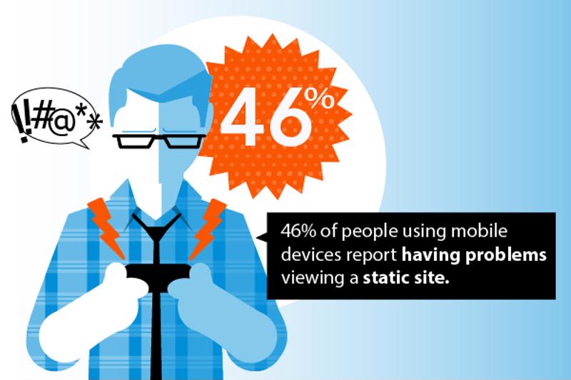
While website content was once forced to remain stagnant, technology has since evolved to allow for a more dynamic approach. One visitor can have an entirely different user experience from another visitor who entered the site at the same time, in the same geographical area. This is thanks to responsive design, which optimizes a site for the device on which it renders. The feature is growing in importance, and users have come to a point where they expect a site to be optimized for their device. According to BOP Design blog, 46 percent of people using mobile devices report having problems viewing a static site.
 Make your website dynamic.
Some brands are responding to the demand for responsive design and personalized content with unique site redesigns that include different kinds of customization. Here’s how some are adopting this concept:
1. ESPN provides tailored content
ESPN recently went through a site makeover that has sports fans from all over rejoicing. Depending on a user’s past visits, tailored content will show up on the homepage, eliminating the need for returning visitors to sift through irrelevant content. They’ll find all of the latest headlines on their favorite sports teams right away without having to put in any effort.
“Our goal is simple,” explained the brand in an article devoted to its redesign. “Make what matters most to you easily accessible the moment you want it, wherever you are.”
Not only will the site pull in information based on past visits, but it also considers the user’s location, device and customized preferences. Users can tweak their “favorites” section to include various teams and sports, which allows for more relevant information that requires less time and effort on the user’s part.
“Amazon lists related products directly below the main screen.”
2. Amazon includes recommended products
One of the first brands to own the personalization feature, Amazon lists related products directly below the main screen. This is now a concept that many B2C sites have adopted. Using a special algorithm, the site produces a list of related products that users might be interested in checking out further. It pulls information based on previously viewed products, past purchases and user ratings. This means that theoretically, the recommended products bar just gets more accurate the more a user visits the site and makes purchases. It’s this convenience and continuously improving customization that makes the feature so compelling among consumers.
3. Intuit QuickBase and dynamic Calls to Action
HubSpot reported that Intuit QuickBase uses a special algorithm that greets users with specific calls to action. Depending on the site visitor’s stage of purchasing, a different offer will show. For example, when he or she first comes to the site, the opportunity to download a helpful ebook appears. The ebook and surrounding messaging is tailored to new users who are in the first stage of the funnel. After a person downloads the ebook, he or she won’t see the same offer on that landing page. Instead, a message to attend a webinar will appear, which will help guide them through to the next stage of the buying process.
The customization feature seems to be a success. According to HubSpot, Intuit has since gotten click through rates of 10 percent on personalized CTAs and click-to-submission rates close to 100 percent. When designing your own site, it’s important to keep these metrics in mind and consider using personalized calls to action for all of your brand’s enticing offers.
Contract and Direct Hire job openings are updated daily. View all job listings here!


